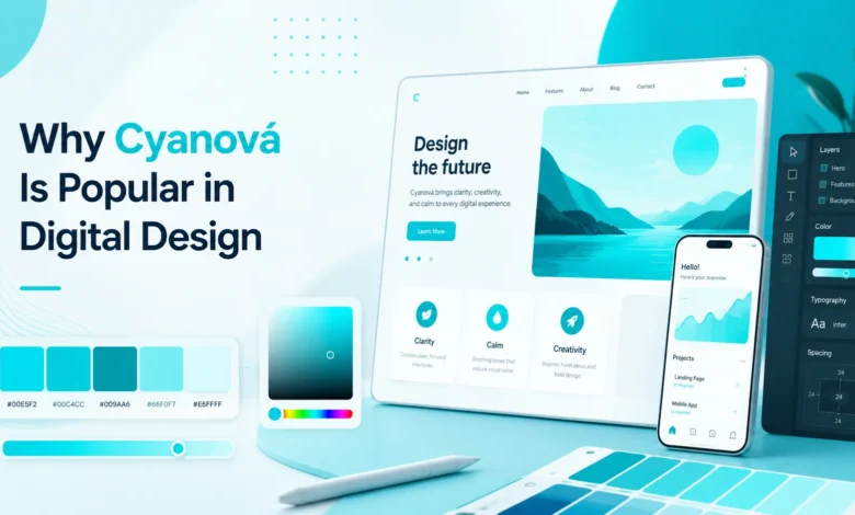
Cyanová has become a familiar color idea in digital design because it feels fresh, bright, and modern. It sits between blue and green, so it carries a clean look without feeling too cold or too heavy.
In online design, color is not only decoration. It helps users feel something, notice something, and move through a page with less effort. That is one reason this bright blue-green shade often appears in websites, apps, banners, icons, and brand visuals.
The popularity of Cyanová also comes from its flexible nature. It can feel calm like water, sharp like technology, and lively like a glowing screen. Few colors can do all of that while still looking simple.
Table of Contents
ToggleWhat Cyanová Means in Simple Words
Cyanová is closely connected to cyan, a bright greenish-blue color. It is lighter than deep blue and cooler than pure green. This balance makes it useful when a design needs a clean and open feeling.
Many people see this shade as peaceful, clear, and digital. It can remind viewers of water, sky, glass, light, and modern screens. These natural and digital links help it feel familiar even when it looks bold.
In design work, Cyanová is often used when a brand wants to look fresh, smart, and easy to trust. It does not feel as formal as navy blue, but it still gives a sense of order and clarity.
Why Digital Designers Like This Color
Designers like Cyanová because it stands out quickly on screens. It has a bright quality that catches the eye, especially when used against dark, white, or neutral backgrounds.
At the same time, it does not usually feel aggressive. Some bright colors can look too loud, but this blue-green tone often feels cleaner and softer. That makes it helpful for buttons, highlights, icons, and section accents.
It also works well in many design styles. A tech website can use it for a futuristic look. A wellness app can use it for calmness. A creative brand can use it to feel fresh and energetic.
The Modern Feel of Cyanová
Cyanová feels modern because it is strongly connected with screens and light. Digital displays can show bright cyan tones very clearly, which makes the color feel natural in online spaces.
This color also matches the look of many modern tools, dashboards, and user interfaces. It can make a layout feel sharp without making it hard to read. That balance is very useful in clean digital design.
Another reason it feels current is its link with glowing effects. Designers often use cyan-like tones in gradients, shadows, neon lines, and futuristic graphics. These effects can make a page look more active and polished.
How Cyanová Helps User Attention
A strong color can guide the eye, and Cyanová does this very well. When used in the right place, it can help users notice buttons, links, forms, badges, and important messages.
Good design should not make people think too hard. A bright accent color can tell users where to look next. This makes the page easier to scan and improves the overall user experience.
For example, this color can work well for:
- Call-to-action buttons, active menu items, pricing labels, app icons, notification badges, and small design highlights that need quick attention.
The key is control. If the color appears everywhere, it loses power. When used in selected areas, it becomes much more useful.
Cyanová in Website Design
Websites often use Cyanová because it feels clean on both desktop and mobile screens. It can make a page look open, light, and easy to explore.
This color works especially well in headers, hero sections, icon sets, and feature blocks. It can also bring life to plain layouts that use white, gray, or black as the main background colors.
For business websites, it can suggest clarity and trust. For creative websites, it can suggest energy and originality. For technology websites, it can suggest speed, innovation, and smart digital thinking.
Cyanová in App Interfaces
App interfaces need colors that are easy to understand. Cyanová can help show active states, progress, selected tabs, and helpful alerts without looking too harsh.
Mobile screens are small, so every color choice matters. A clean blue-green accent can separate key actions from normal content. This helps users move through an app faster.
It is also useful in dashboards and control panels. Charts, buttons, toggles, and status labels can use this shade to show activity, movement, or fresh data in a clean way.
Why It Works Well With Dark Backgrounds
One of the strongest uses of Cyanová is on dark backgrounds. Against black, charcoal, or deep navy, it can glow without needing too much extra detail.
This contrast creates a futuristic look. That is why many gaming, finance, software, and creative tech designs use cyan-like accents with dark layouts. The result often feels premium and high-energy.
Still, designers must be careful with text. Bright cyan text on a dark background can look stylish, but it should be tested for comfort. Long reading sections usually need softer contrast and stable spacing.
Why It Works Well With Light Backgrounds
Cyanová can also look clean and friendly on light backgrounds. On white or pale gray, it feels fresh, open, and simple. This is useful for brands that want a softer digital look.
Light layouts often need accents to avoid feeling empty. A blue-green highlight can add life without making the design feel crowded. It can bring focus to buttons, cards, and small visual details.
When used with light backgrounds, this color often works best in balanced amounts. Too much brightness can feel sharp, but a controlled touch can make the page feel clear and inviting.
Color Pairing Ideas for Cyanová
Cyanová pairs well with many colors because it sits between blue and green. It can feel calm with soft neutrals, bold with dark tones, and playful with warm accent colors.
White, black, gray, navy, and soft beige can all support this shade nicely. These colors let the blue-green tone stand out without making the design too busy.
Warm colors can also work, but they need care. Coral, orange, and soft yellow can create strong contrast. This can be useful for banners, creative visuals, or product cards where energy matters.
Branding Benefits of Cyanová
Brands use color to shape first impressions. Cyanová can help a brand look fresh, clean, smart, and approachable. This makes it useful for digital services, creative studios, apps, health platforms, and tech products.
It can also create a sense of openness. Since the color connects with water, sky, and light, it may feel clear and easy to understand. That can help brands that want to appear simple and user-friendly.
However, it should match the brand voice. A serious legal firm may need a deeper, calmer palette. A new app, design tool, or online service may find this color much easier to use naturally.
Readability and Accessibility Matter
A beautiful color is not enough if people cannot read the content. Cyanová can be bright, so designers need to check how it looks with text, icons, and backgrounds.
Small text should not rely only on a bright blue-green shade. It may look thin or hard to read, especially for users with low vision or in bright sunlight. Strong contrast helps more people use the design comfortably.
Color should also not be the only way to show meaning. For example, an error, success message, or active state should also use labels, icons, shapes, or clear wording. This makes the design easier for everyone.
Common Mistakes to Avoid
One common mistake is using Cyanová too much. When a bright color fills every section, the design can feel noisy. The color works better when it has space to breathe.
Another mistake is placing it over similar light colors. Pale cyan on white may look weak, and bright cyan text on white may not be comfortable for every reader. Designers should test every important area.
A third mistake is using the color without a purpose. Every strong color should have a job. It should guide attention, support the brand, improve clarity, or add emotion. Random use can make a design feel less professional.
Best Uses in Digital Content
Cyanová is especially useful for digital content that needs a clear and modern tone. It can improve feature images, article graphics, product cards, banners, and social media visuals.
It can also help explain ideas visually. For example, a guide about technology, communication, design, or online tools can use this shade to feel more connected to the digital world.
For long content pages, it works best as an accent. Headings, small icons, divider lines, and selected buttons can carry the color while the main text stays easy to read.
Final Thoughts
Cyanová is popular in digital design because it offers a strong mix of freshness, clarity, and modern style. It feels bright but not always loud. It feels calm but not boring. That balance makes it useful for many online projects.
Its place between blue and green gives it wide visual appeal. It can support trust, creativity, technology, movement, and clean communication. This is why it appears in websites, apps, dashboards, brand visuals, and digital graphics.
The best results come from thoughtful use. When designers control contrast, spacing, background choice, and color pairing, Cyanová can make a digital layout feel more polished, useful, and memorable.
Frequently Asked Questions (FAQs)
What is Cyanová in digital design?
Cyanová is a bright blue-green color idea linked with cyan. In digital design, it is often used to create a clean, fresh, and modern look on websites, apps, and graphics.
Why is Cyanová popular online?
It is popular because it stands out well on screens while still feeling calm and clear. Designers use it to guide attention, support modern branding, and make layouts feel more lively.
Is Cyanová good for website buttons?
Yes, it can work well for buttons when the contrast is strong enough. It is best used for important actions, but it should not be overused across every part of the page.
What colors go well with Cyanová?
It pairs well with white, black, gray, navy, and soft neutral shades. It can also work with warm colors like coral or orange when the design needs stronger energy.
Can Cyanová be used for text?
It can be used for short text, labels, or highlights, but it must be easy to read. For long paragraphs, darker text usually works better because it gives readers more comfort.
Is Cyanová only for technology brands?
No, it is not only for technology brands. It can also work for wellness, education, creative, lifestyle, and communication brands when the goal is to look fresh, clear, and friendly.
Read More: Willowmagazine.co.uk